First | Prev | Archive | Next | Latest
First | Prev | Archive | Next | Latest
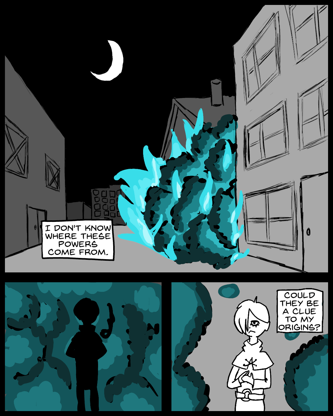
The explosion here could use a lot of work. I wanted it to be a cyan ball of smoke and flame. Unfortunately, it came out looking like a bush. I don't know how to improve it.
I'm happy with the background art on the first panel. It's quite perspective-heavy, and it felt good whenever I figured out how things were supposed to line up.